# Why did we do this work?
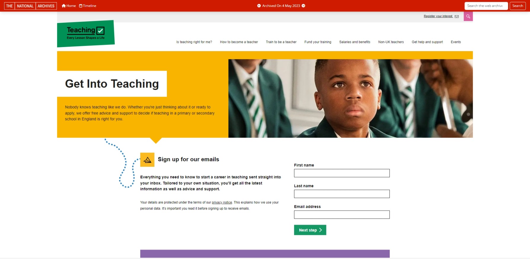
We currently have too many options in our top navigation menu which are very similar, making it difficult for users to effectively navigate around the site.
We also have lots of orphan content and the site’s information architecture is not built to provide homes for new content.
We want to restructure our navigation to future proof it for new content. To inform this, we mapped out our content against our initial teacher training (ITT) user journey map.
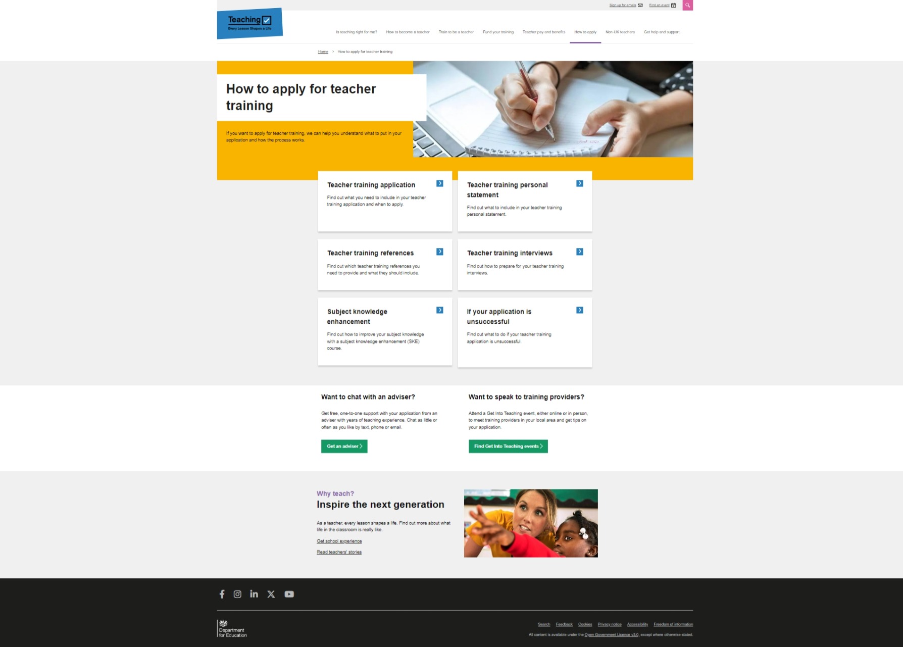
Through doing this, we identified a need for an applications section of the website where we could house our relevant guidance.
This is to make it easier for users to find guidance around the application process, increasing their chances of submitting a successful application for teacher training.
# Creating a new section of the navigation
We already had application content living under our ‘Train to be a teacher’ section.
This change involved a lift and shift exercise, moving it from its old home to a new ‘How to apply’ section.
# Future considerations
We’re currently using an old category page design that we first introduced in May 2022.
We want to relook at this design to see how it could be improved.
We’ve also conducted a card sort to see if our information architecture aligns with users’ mental models. Further iterations may be made based on these findings.
# Screenshots

