# Why we did this work
The website’s current top navigation takes users to a category page where they can then view the subcategories and find the page they’re looking for. This means there’s no way for a user to know what’s in each category without going into that category page.
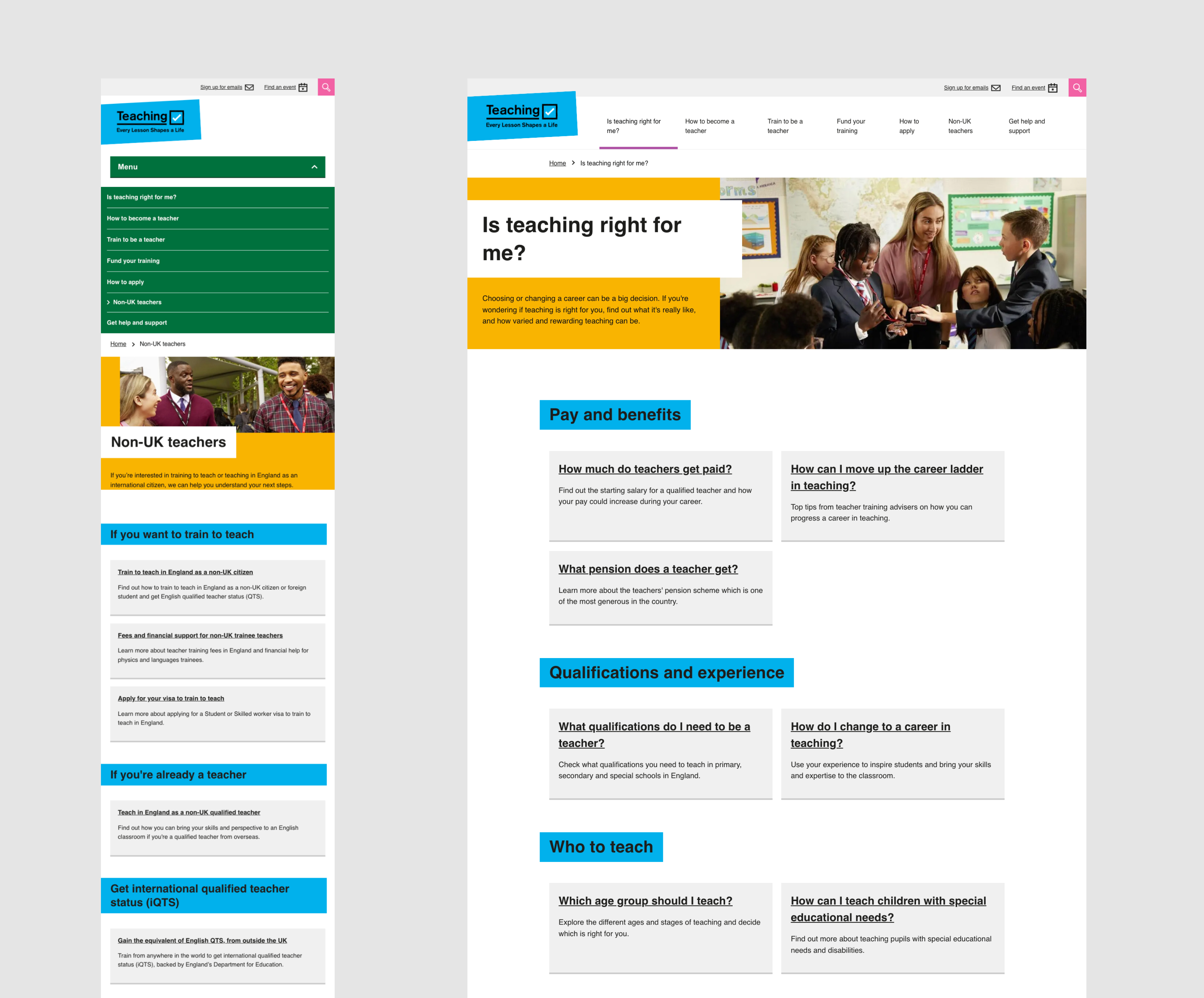
User research sessions showed that participants found this frustrating. The category pages are long and take a while to scroll down, especially on mobile. Some users expected to see a drop down in the menu to help them view what’s in each category.
# What we did
We did desk research and analysis looking at different styles of websites and their navigation that our users might be familiar with. Including where users might be looking for a specific item or just want to browse, and sites that might help a user find a new career.
There is no government design system pattern for a drop-down menu with subcategories. But there are different types of navigation used across different government sites, for example, side navigation or a drop down used on design.education.gov.uk on mobile. We used these where possible to help inspire our navigation designs.
# We started with mobile-first designs
Over 60% of our users access the Get Into Teaching website on a mobile device. So this needed to be our first consideration. We explored two types of mobile menus with subcategories.
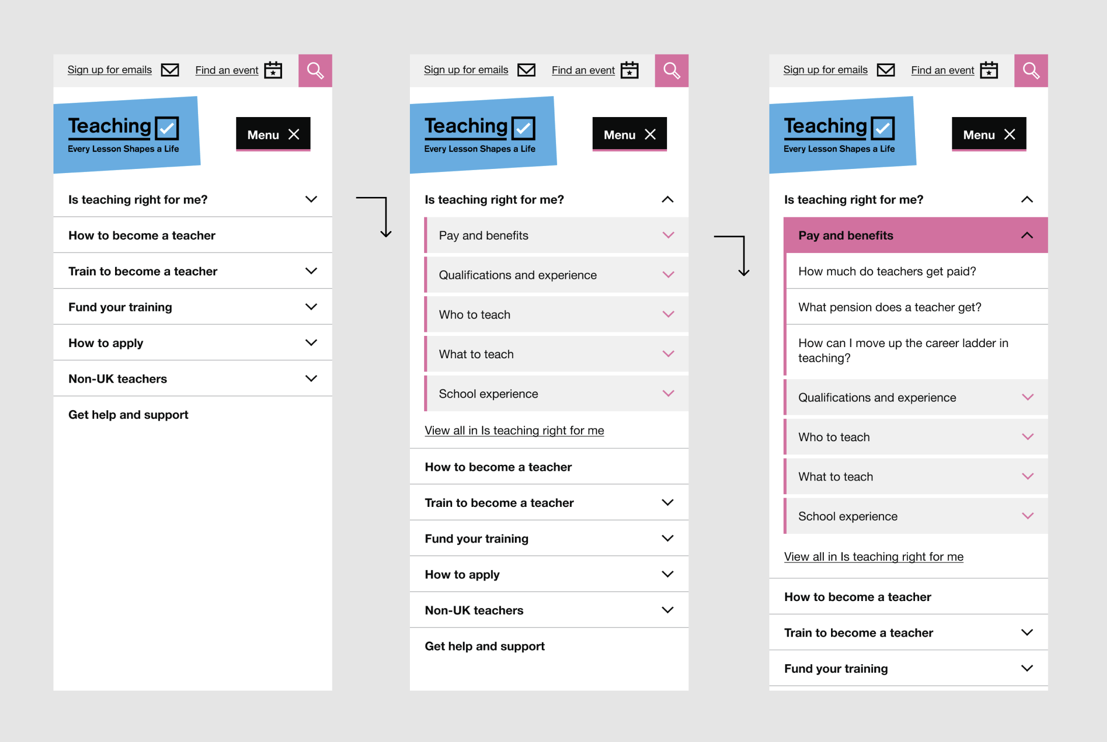
We felt an accordion style navigation would allow users to explore content in sections without having to commit to a particular page, something that had come up in previous research sessions.
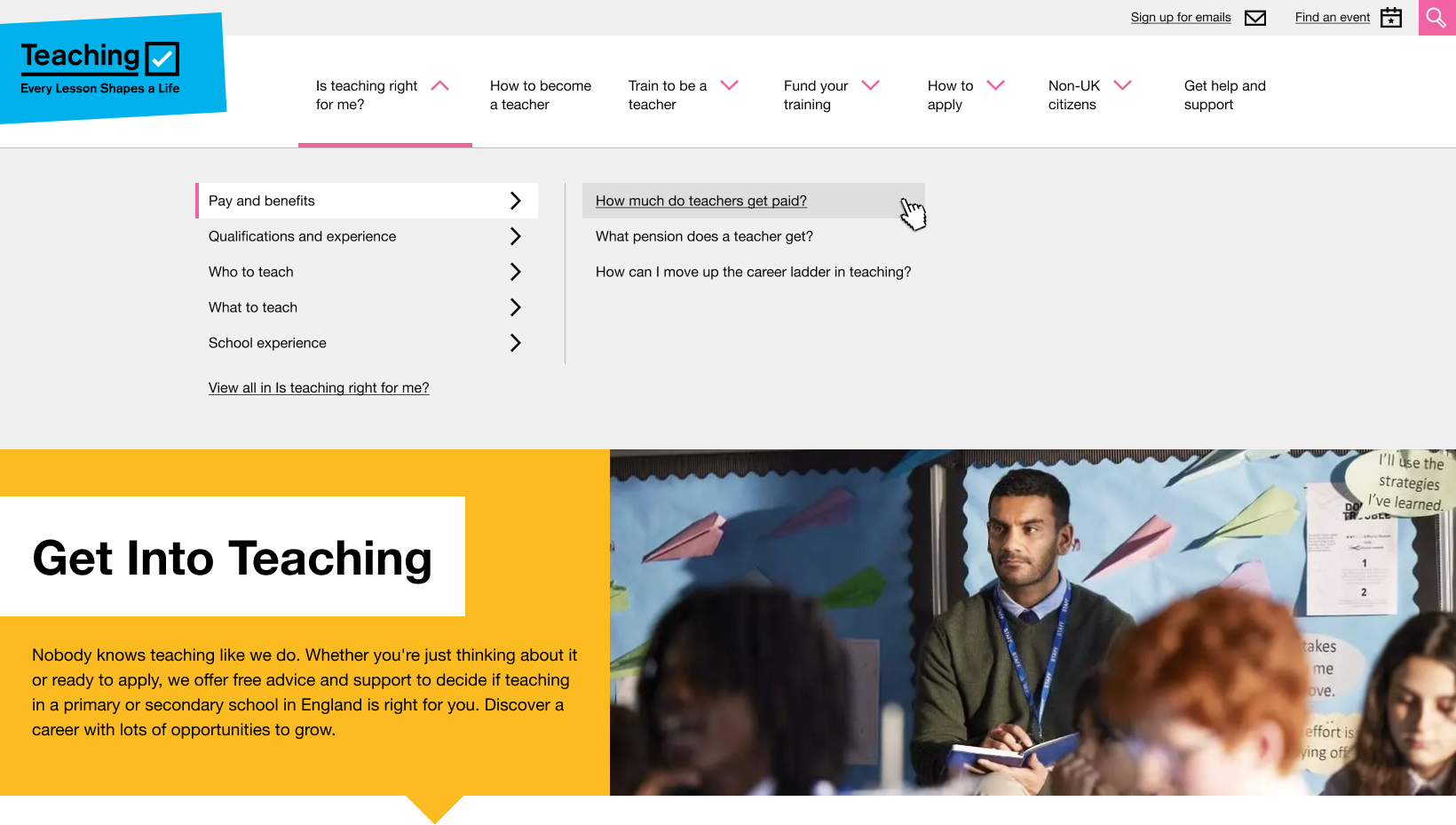
# We explored desktop navigation ideas
We created a design showing subcategories within a section. When a user clicks (this works better than hovering for screen readers) it reveals the pages within that section. We felt this design would enable users to easily find the subcategories and the information they need or help them to understand what’s in a section so they can explore.
# We developed some principles and guidelines for our navigation
- 3 clicks to get to a page on the website
- maximum of 10 items within a category or subcategory
- list categories and page links in the order most used by our users
- where possible use shorter names for links
- support keyboard navigation via pressing enter
- items to appear on click rather than on hover
# What we’ll do next
We’ll start building the navigation soon and we’ll monitor in future user research sessions how easily participants can find what they’re looking for. We also plan to use data insights to measure how effective the navigation is in helping users.