This was an AB test now gone live. Results from AB test were fairly similar but the new design puts the user in control of searching for events using a more accessible and open filtering option.
Ultimately, this resulted in reducing a lot of tech debt for the developers from the original page.
# Landing:
- Change of approach. Rather than splitting events by type allow users to search all events and filter out based on preference.
- 2 column layout
- Event types descriptions added into a ‘details’ component.
- Try to push events as high up page as possible.
- New card layout for events
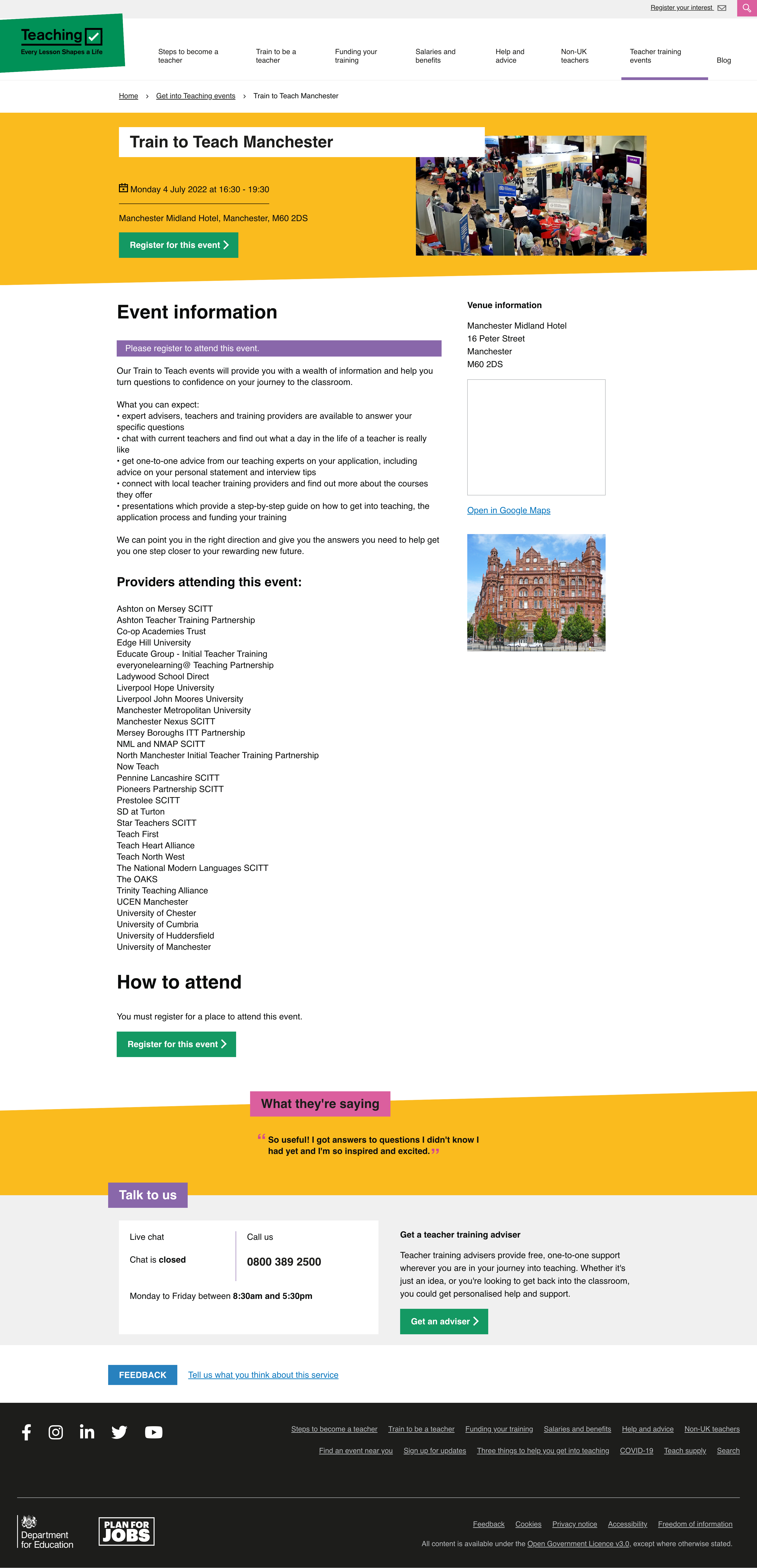
# Individual event
- Used ‘subject specific’ layout to try and inspire a bit more (this layout is in its infancy)
- Build didn’t quite match the design so will revisit further down the line
# Get Into Teaching events
- Renamed “Train to Teach events” to “Get Into Teaching events”
- New card layouts used
- Used ‘subject specific’ layout to try and inspire a bit more (this layout is in its infancy)
# Screenshots


