To make the events section easier for users, we updated the the ui on a number of fronts:
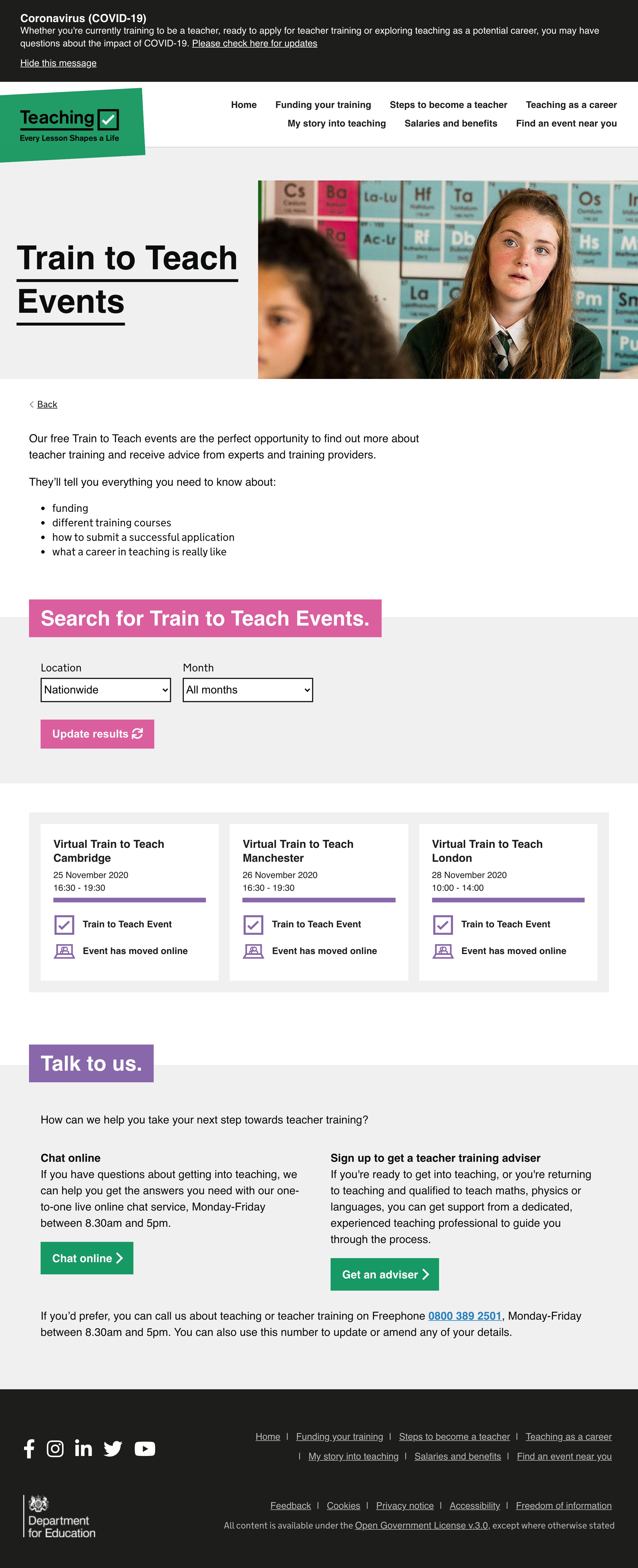
# Landing & Category page:
- Added snippets prior to search box to explain each event type to help users decide how to search.
- Added “Some events have moved online” box.
- Updated colours. We’ve limited colours to just two, purple to highlight TTT events and blue for all others.
- UI changes to how boxes are displayed.
- Remove snippet and is often repetition of event title.
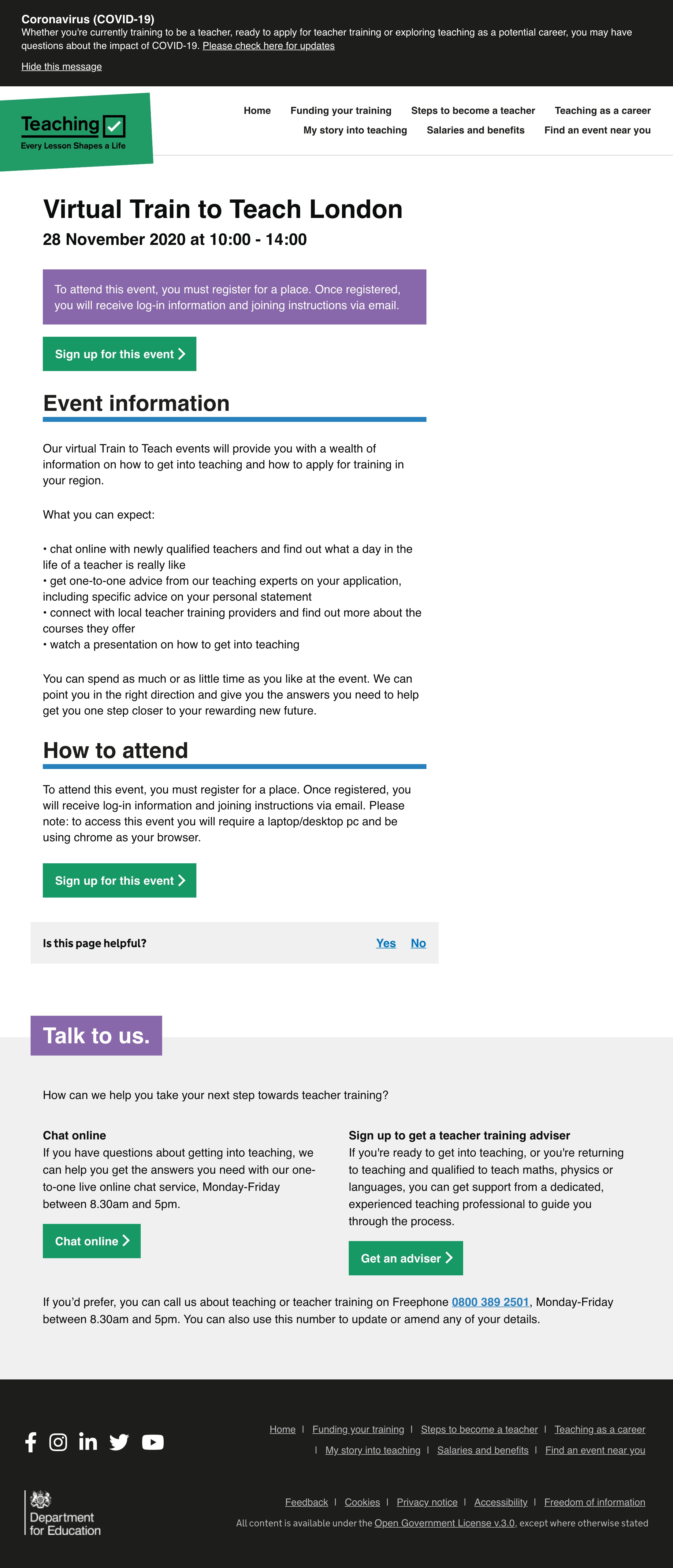
# individual Page
- Moved boxed information from sidebar to main content column, as analytics indicate it wil be engaged with more in this position.
- CTAs now at top and bottom of page so users who skim and users who digest can both find
# Screenshots


