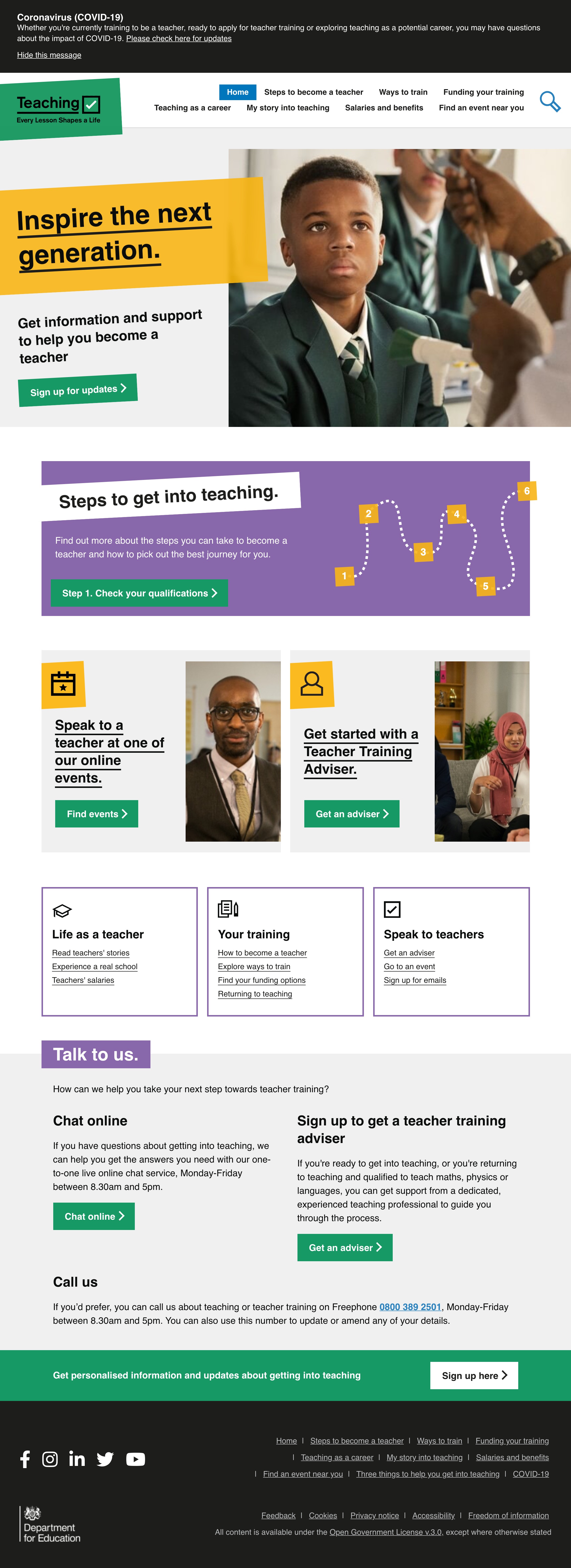
After analysis showing a lack of engagement in lower components and feedback from users about too many colours, we decided to streamline the homepage with an emphasis on the 3 routes to contact and the steps to become a teacher.
We replaced the three CTA boxes with 3 ‘directory’ boxes to give users a clear picture of where they can go on the site. These links will be tweaked following analysis over the next few weeks. The directory may also help us decide how to re- organise the navigation based on what is being engaged with.
# Screenshots
