# What we did
Revising the service proposition was a core recommendation that came out of the recent user research. These findings suggested that:
- Users rarely read the service proposition, and instead are drawn to the navigation bar to tell them what the rest of the website is about
- High Fliers: Students feel there is more of a focus on how to get into teaching, rather than an introduction to the teacher profession
- High Fliers: Students expect something to tell them what GiTis about, who is behind it and what to expect
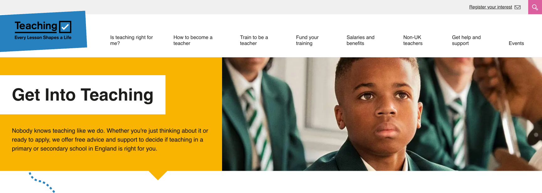
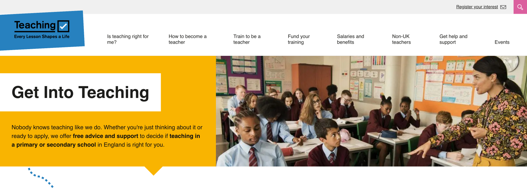
Following a number of design iterations, it was decided that simply emboldening certain portions of the text would help to catch the eye more effectively.
To further highlight and enhance the impact of this change, we decided to update the hero banner image, which had been in place since February 2021.
# What we’ll do next
We will be monitoring the impact of this change and making further improvements if required. It is likely we will look to increase the font size as part of the next iteration.
# Screenshots

