# What we did
User research suggested the menu button - which is only visible on tablet and mobile - was being overlooked more often than not. This severely impacted the ability of users to navigate the website effectively.
To remedy this, we redesigned and relocated this component. This included:
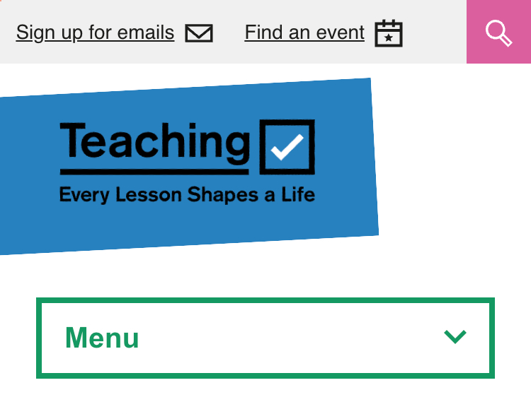
- changing the background colour of the logo from green to blue as this was clashing with default CTA colour, therefore reducing the visibility of the menu button.
- thickening the border of the menu button to match the thickness of the tick box in the logo, helping not only to tie the two components together aesthetically, but also make the menu button more eye-catching.
- increased the font size and change the colour to match the border.
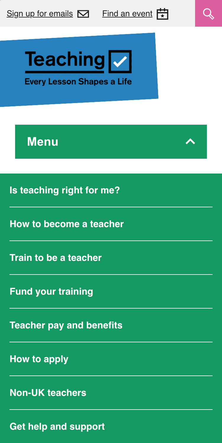
- replaced the hamburger icon with a down arrow, indicating more clearly that a drop-down menu will appear when clicked. Conversely, the ‘X’ icon has been replaced by an up arrow when the menu is open, again hinting at what clicking this element will do.
- changed the background colour of the drop-down menu from white to green so as to tie the menu button and navigation together.
There were also a few smaller padding and spacing changes implemented which helped to improve the clickable area available to the user whilst also making the component more aesthetically pleasing.
# What we’ll do next
There are plans to move the menu button to sit alongside the Teaching logo on mobile in the future. We will also continue to evolve the structure of the website. It is therefore likley that the drop-down component will have to accommodate sub-categories, too.
# Screenshots
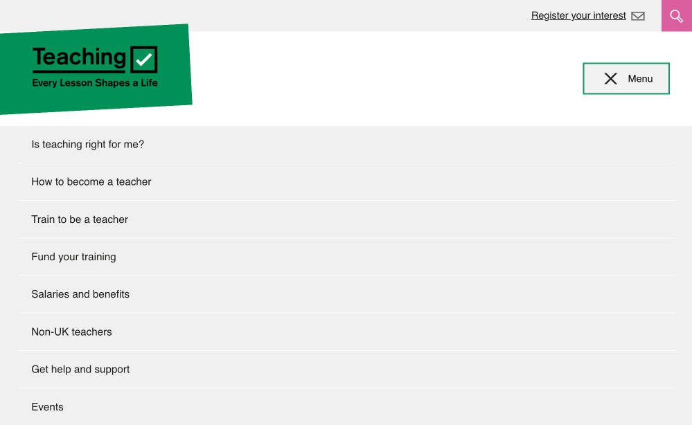
- Previous menu button and navigation on tablet
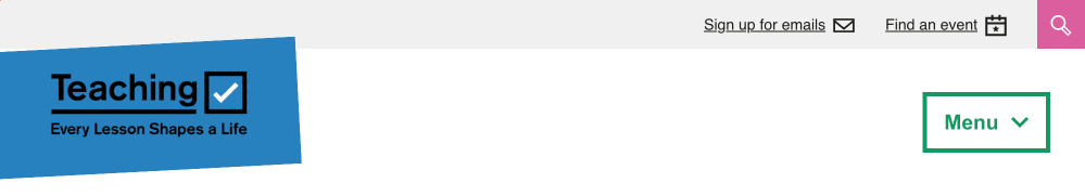
- Updated menu button and navigation on tablet (closed)
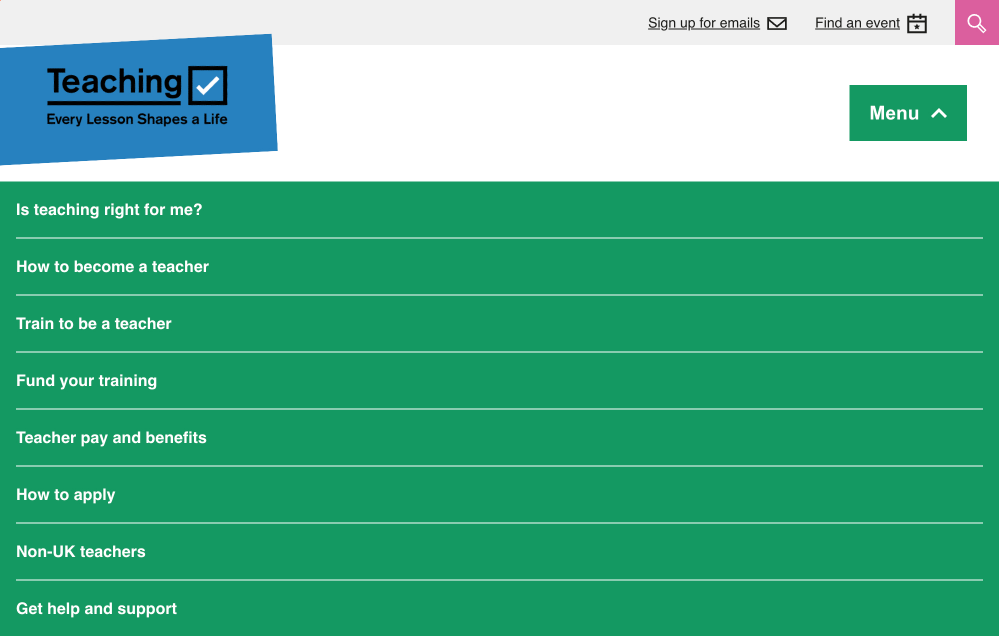
- Updated menu button and navigation on tablet (open)
- Previous menu button and navigation on mobile
- Updated menu button and navigation on mobile (closed)
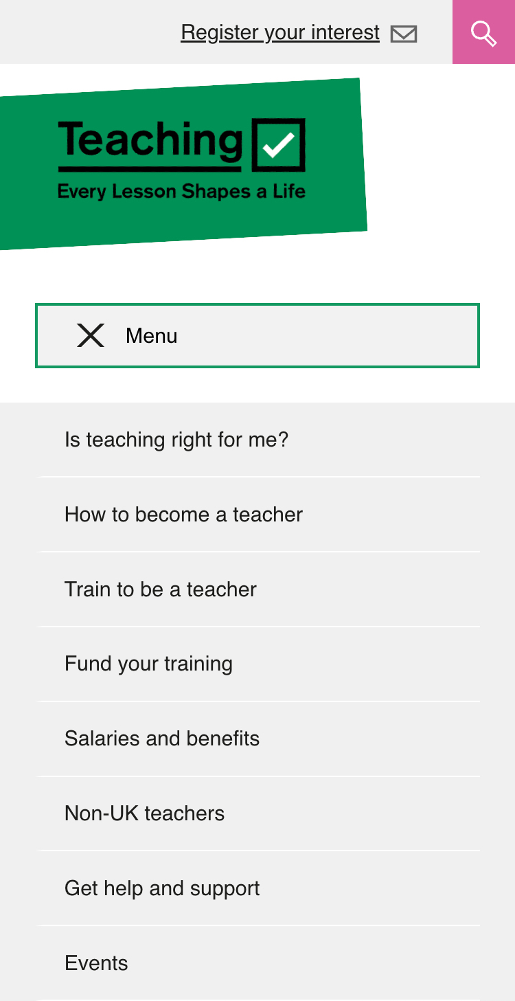
- Updated menu button and navigation on mobile (open)