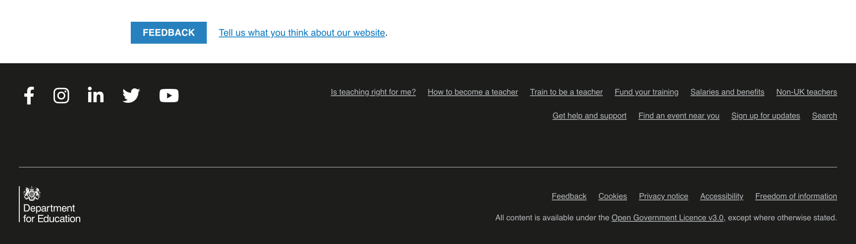
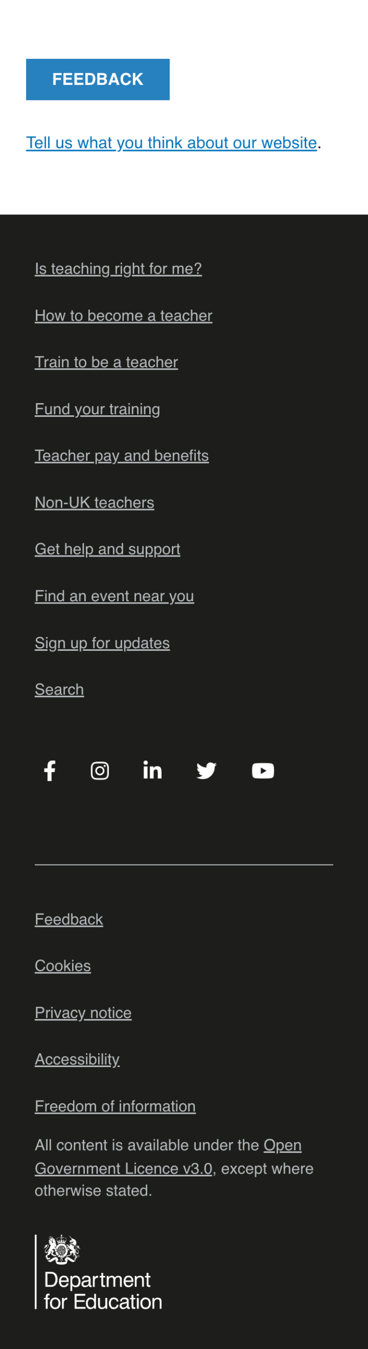
# What we did
The footer of a website is often just an afterthought. So, the team decided to review this portion of the website having concluded that it perhaps wasn’t performing as well as it could be. Brief analysis suggested that the links featured in the footer - many of which were simply duplicates of the primary navigation - weren’t getting click very often. It was also found that, when using a screenreader, the DfE logo would be read out after the social media icons but before the secondary links (such as Feedback and Cookies), and that this wasn’t logical.
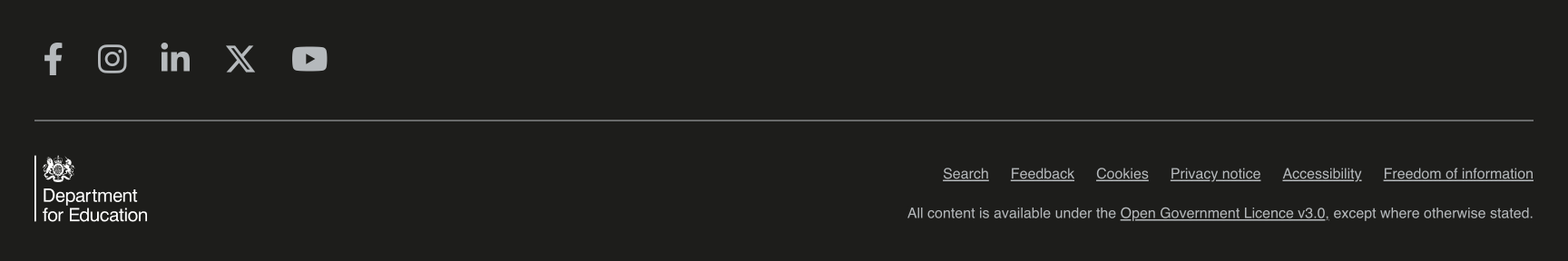
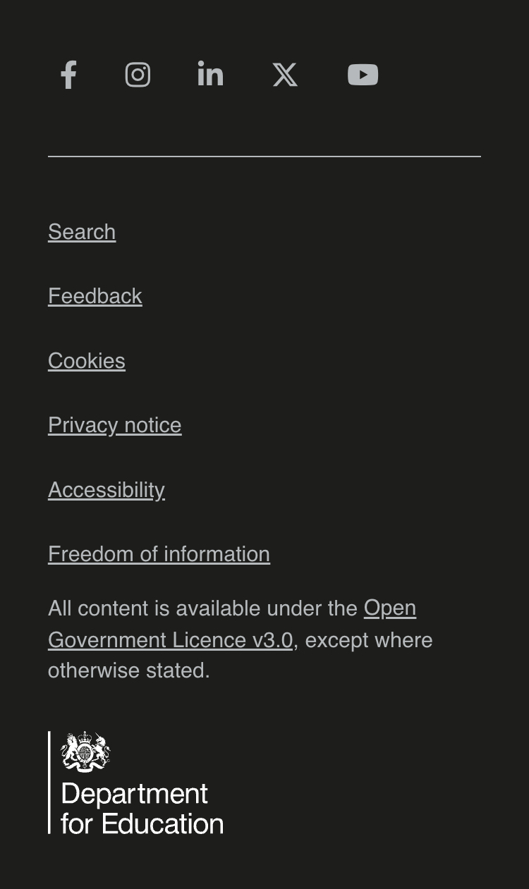
The resultant redesign saw the footer simplified. We removed the duplicated links, which we believe will:
- allow the website to perform better in terms of SEO
- streamline the footer, therefore improving the visibility of the remaining links and icons
We also:
- updated the Twitter logo to the X logo (including the accessible name), following the recent rebrand of the social media platform.
- changed the element states of the social media icons so that, on-hover, the icons would turn from light grey to white, rather than the other way around. This gives a clearer and more logical indication that the icon is active.
- removed the ‘Feedback’ bar as this component was overly large and cumbersome - particularly on mobile - and the link was already duplicated in the footer.
- reorganised the source code to allow the DfE logo to be read out last when interacted with using a screenreader, hopefully improving accessibilty by providing a more obvious conclusion to the website.
# What we’ll do next
We will monitor whether we experience a reduction in the number of clicks on the links we felt were duplicated and, therefore, unnecessary.
# Screenshots