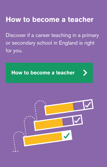
User research was carried out to better understand what users expected from a steps page in terms of content and design.
From the research we learnt that the steps journey was less linear and more of a checklist depending on where the users are in their journey into teaching. The design was updated to reflect that, along with the graphic on the homepage banner.
# Homepage banner design
The design was updated to reflect the findings on the homepage banner as well
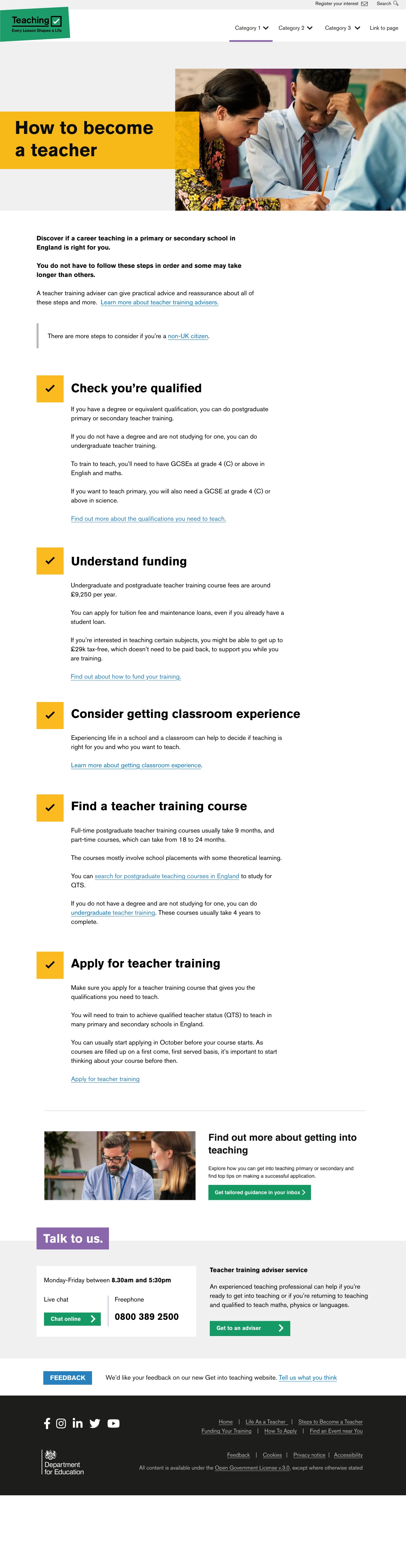
# Screenshots