# What we did
Following a recent accessbility audit, it was found that various components failed colour contrast standards. For example, the following components were found to have an insufficient colour contrast ratio to meet the WCAG 2.1 AAA Contrast (Enhanced) success criteria:
- Primary CTAs
- Blue link text
- White text on a blue background (e.g. h2s)
- Primary CTAs on a yellow or purple background
- Pink quotation marks on a grey background
- Purple promo banners
To address these issues, it was decided that the brand colour palette needed to be updated and, subsequently, a web-safe colour palette, slightly different to that of the offline colour palette, be collated. The following colour adjustments were duly made:
- Blue (#2881be to #00b1eb)
- Dark blue (#0076bd to #1d70b8)
- Pink (#db5e9e to #f162a3)
- Purple (#8967aa to #ad52a4)
- Green (#159964 to #00ab92)
We also updated the primary CTAs to match those of the Government Design System (GDS):
- Primary CTA green (#00703c)
- Primary CTA dark green (#005a30)
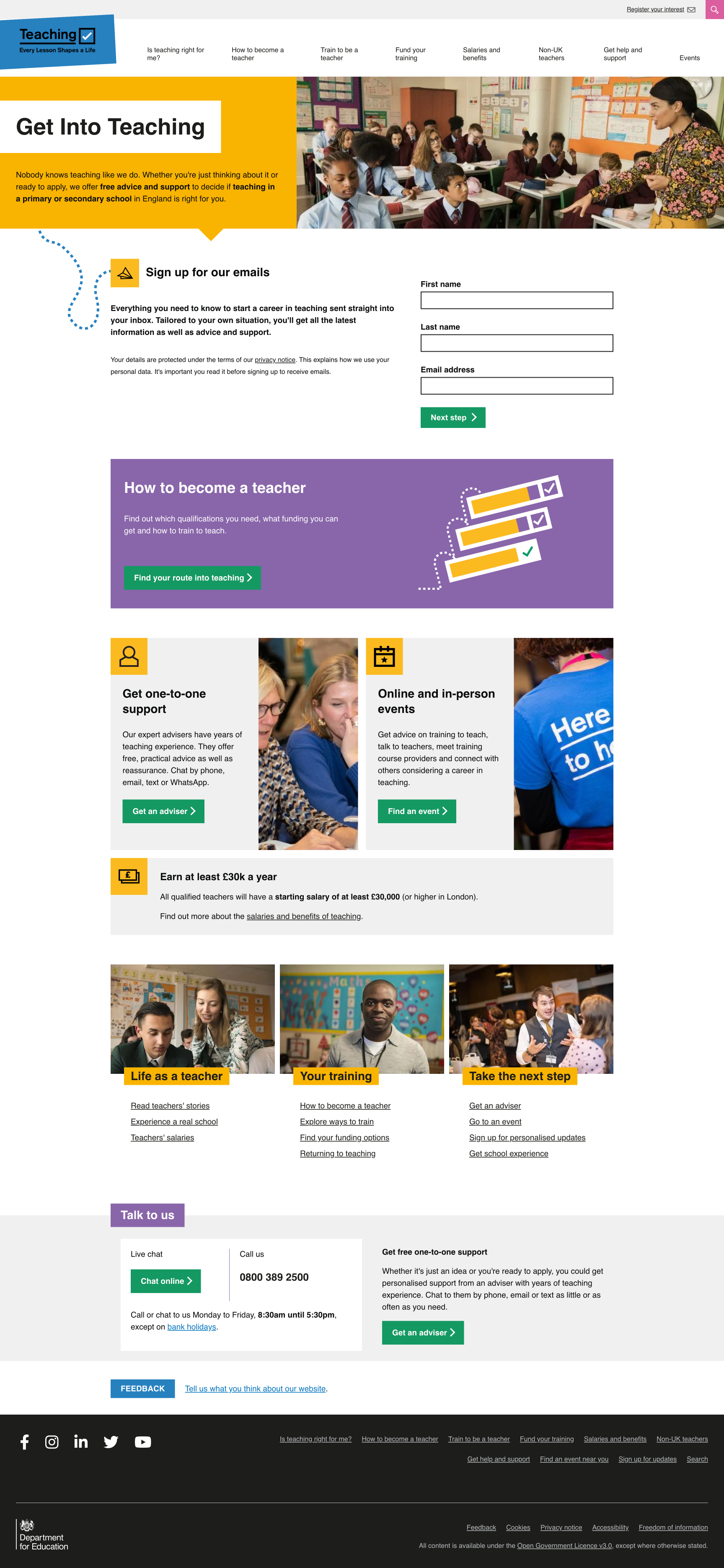
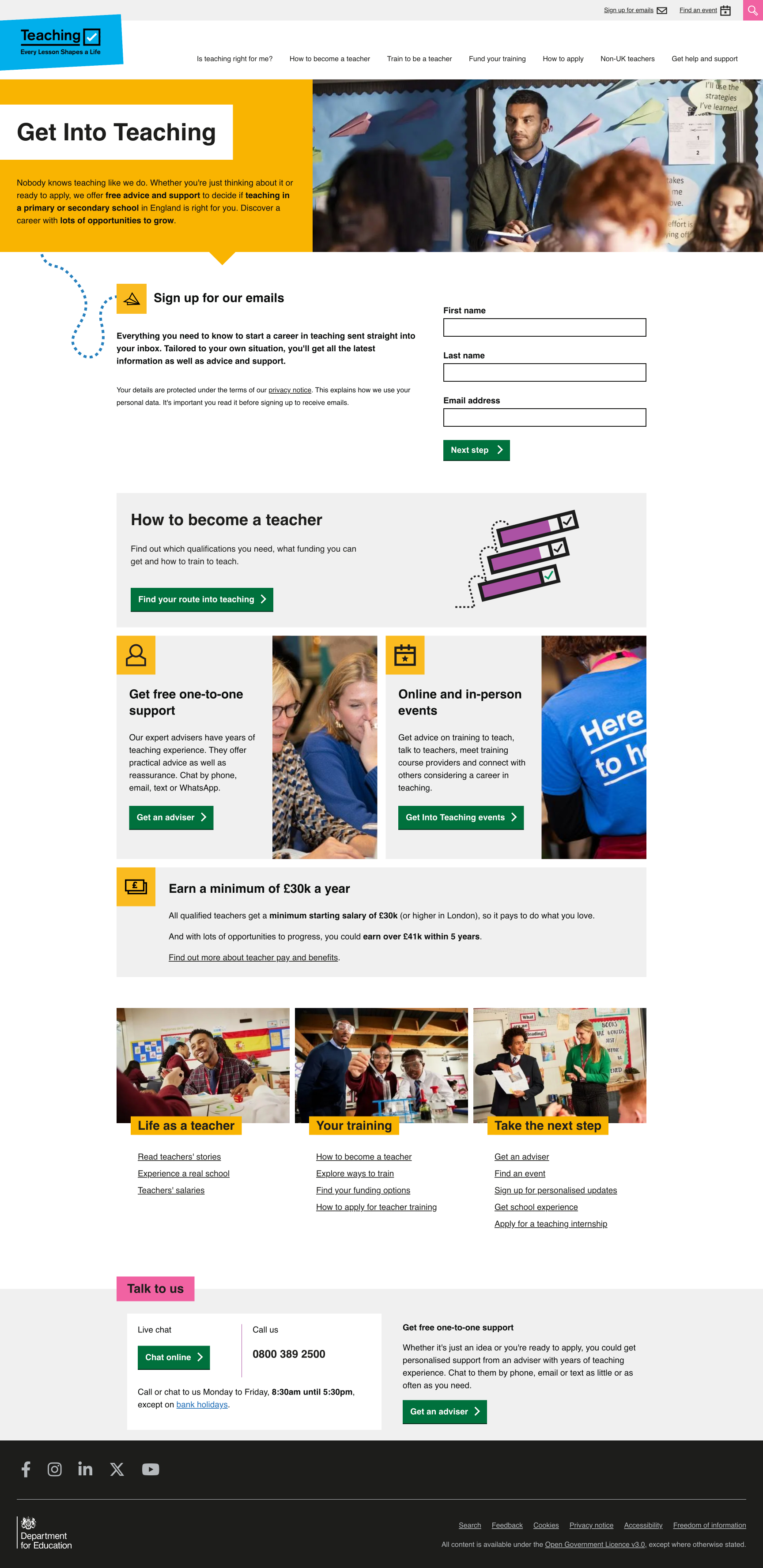
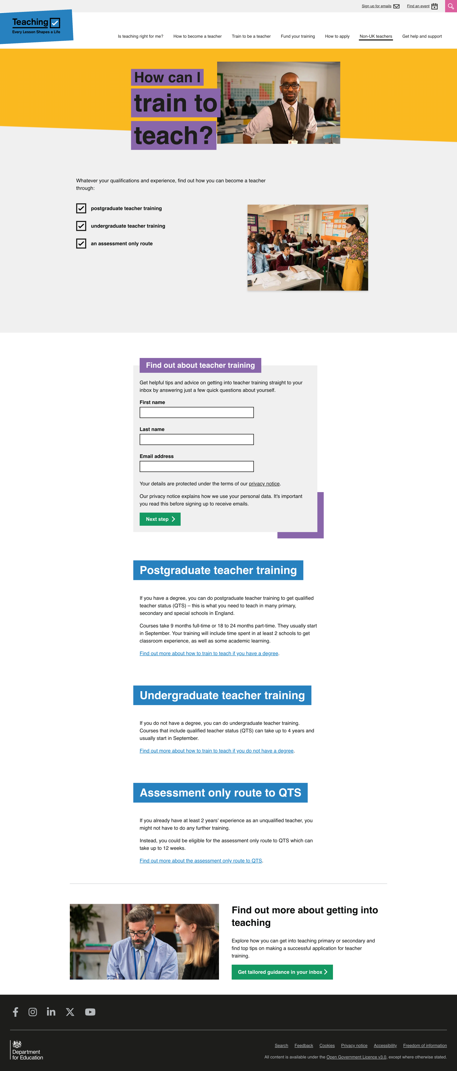
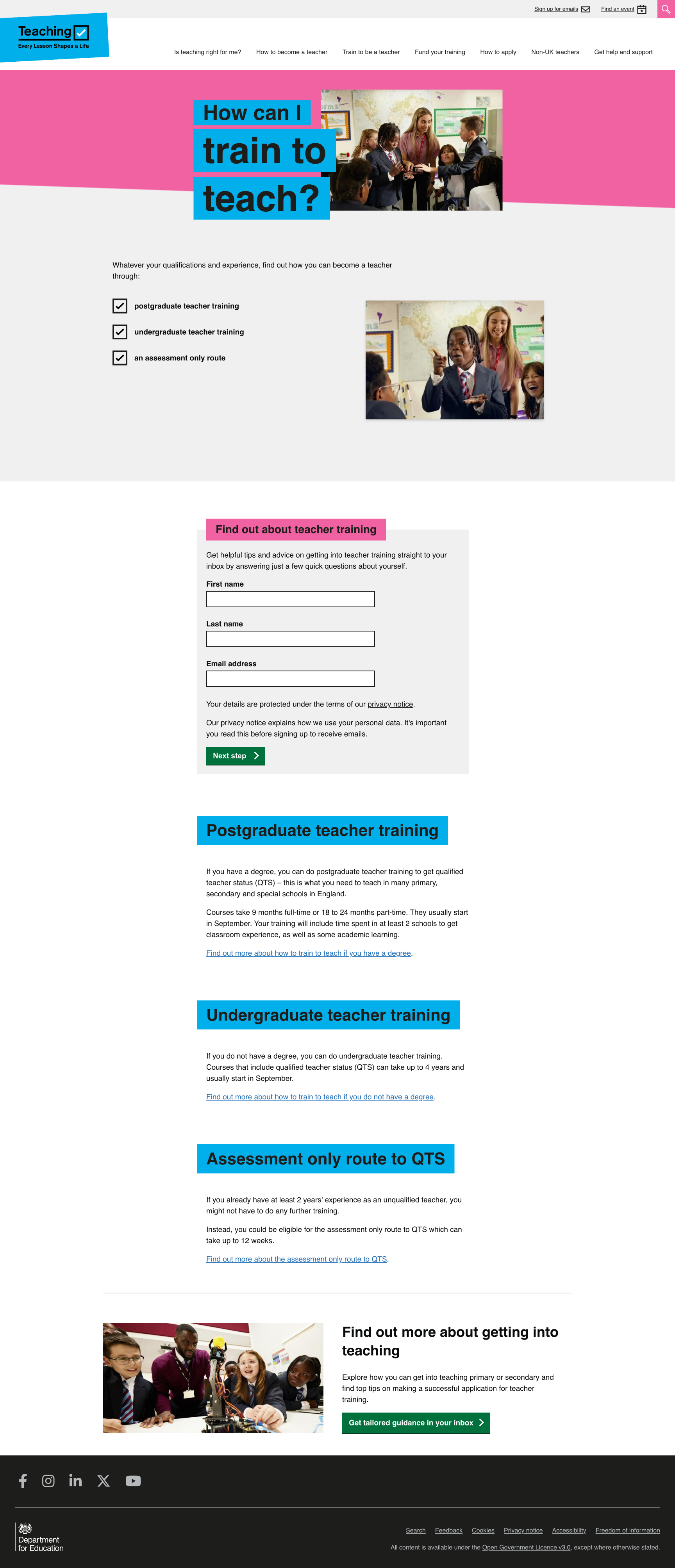
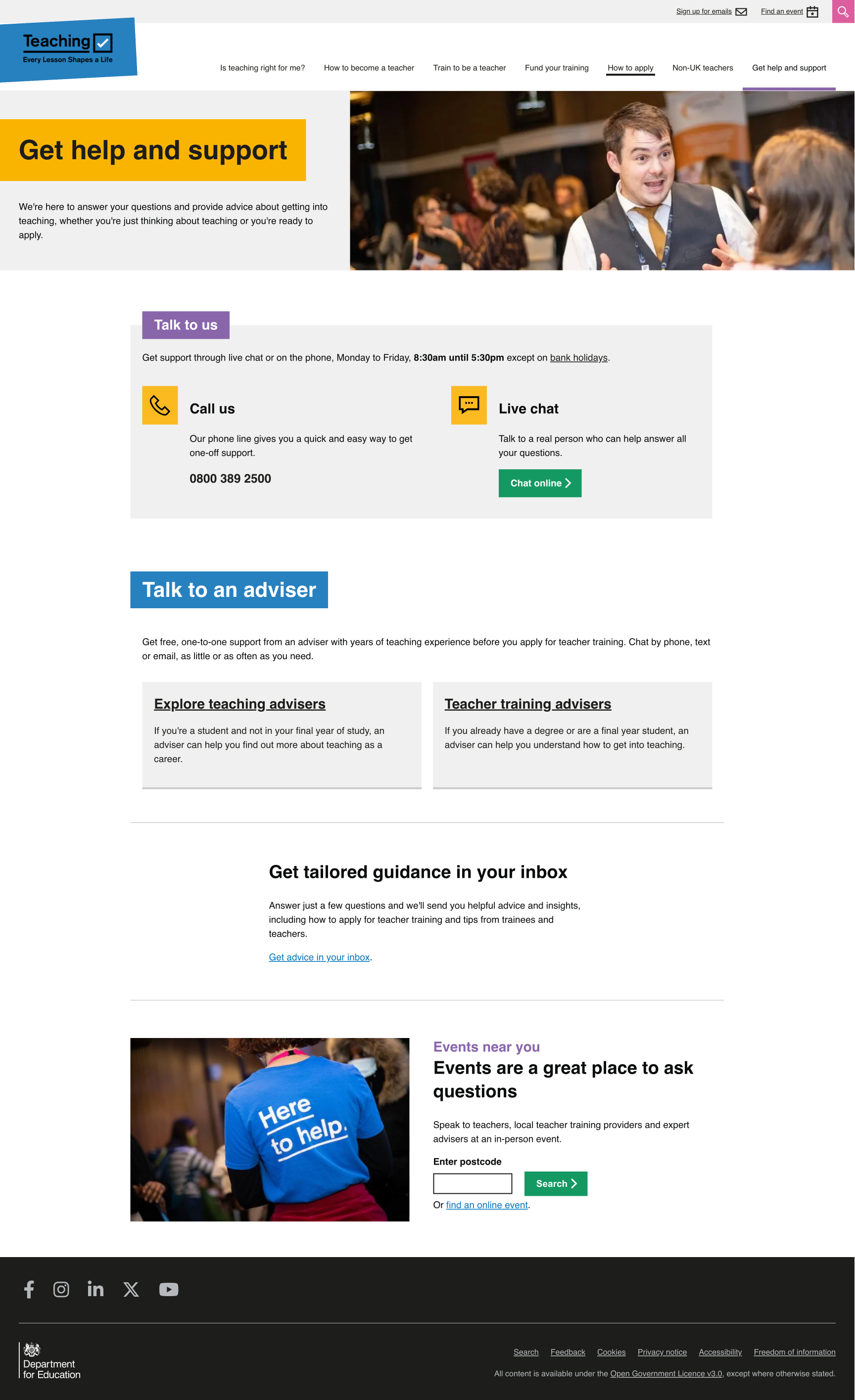
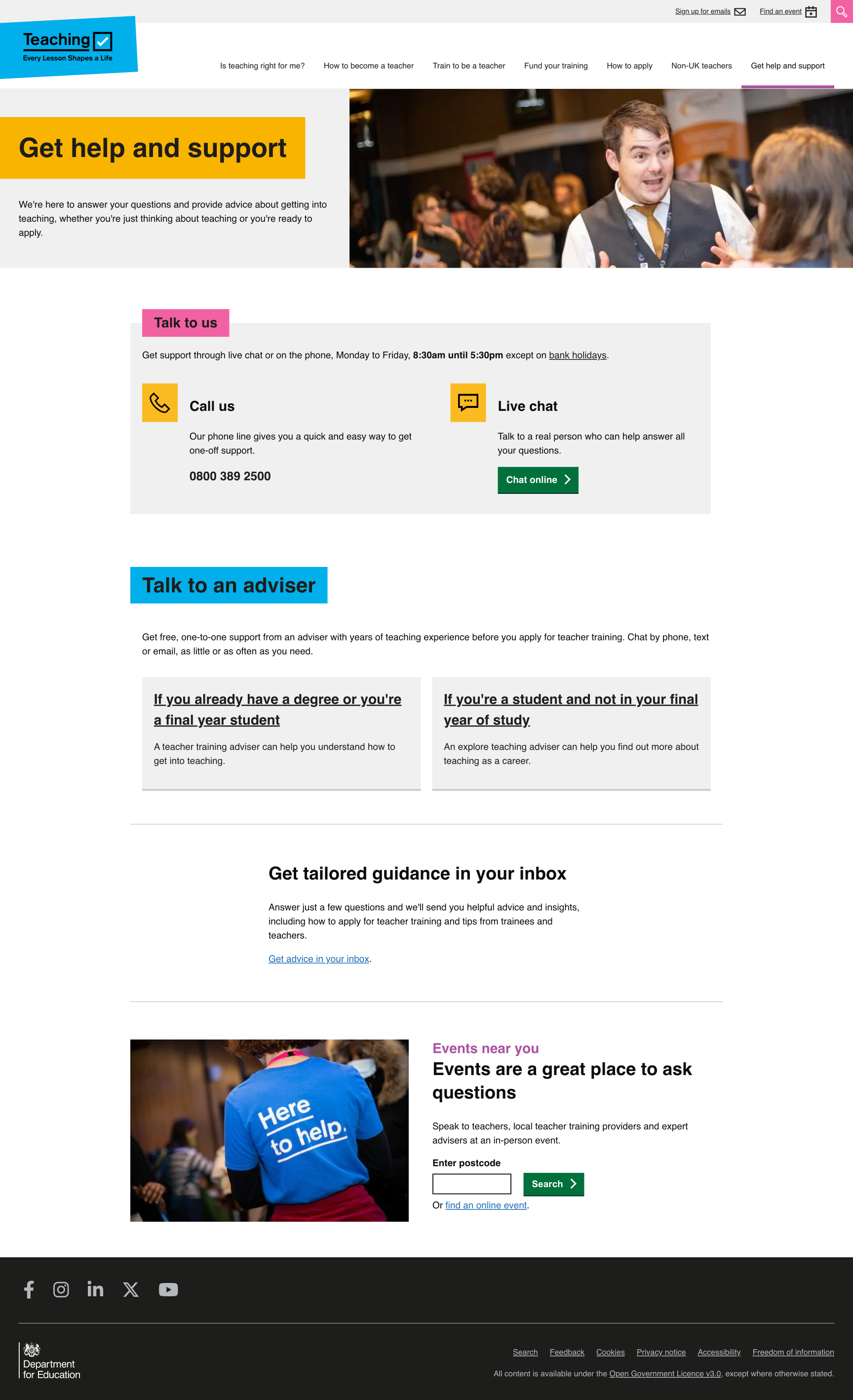
Below are a number of screenshots illustrating how the look and feel of the website changed as a result of the above colour adjustments.
# What we’ll do next
We will continue to check the colour contrast ratio of each and every component that makes up the website and evolve the colour palette as and where needed.
# Screenshots