# What we did
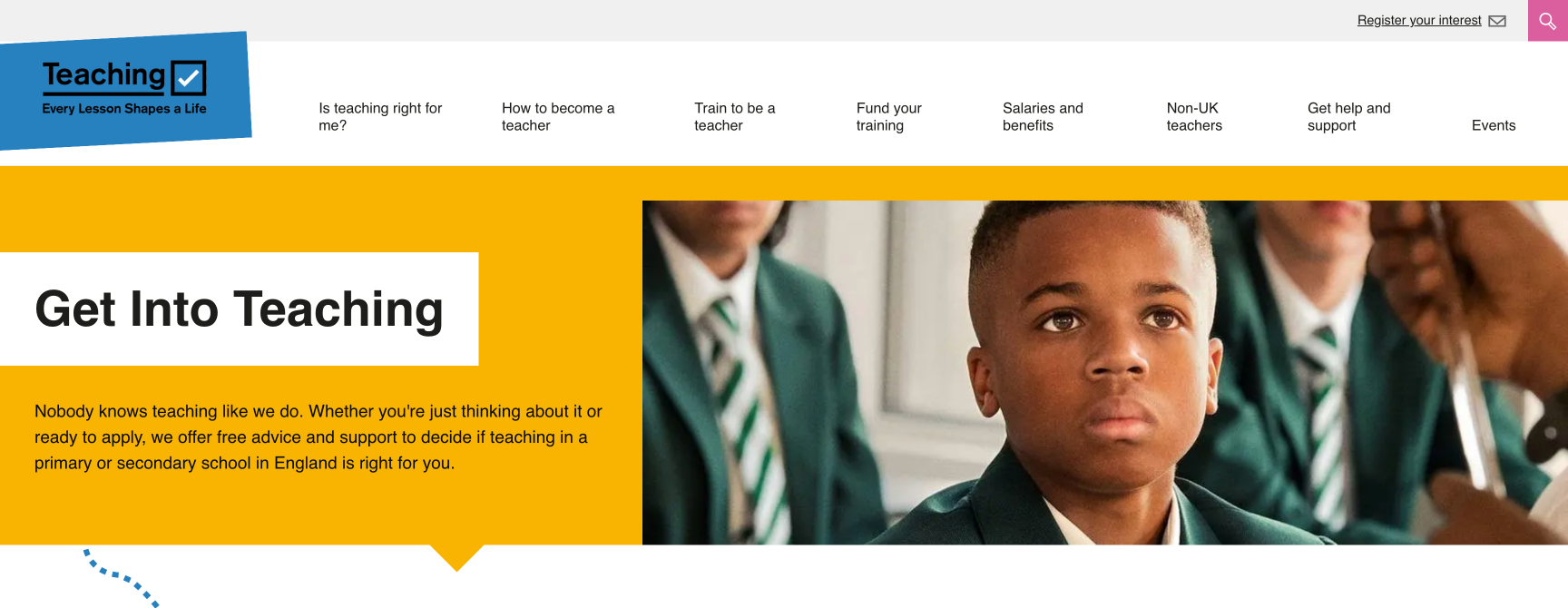
Hero banners feature throughout the website, primarily on the homepage, but also across top-level pages such as this - https://getintoteaching.education.gov.uk/steps-to-become-a-teacher. It was noticed that there was quite a lot of excess padding and spacing in these banners that did nothing more other than to increase their overall height and, therefore, push content further down the page. This was particularly evident on mobile devices.
In order to remedy this issue, we have removed any excess padding from the hero banners. This can be seen when comparing the two screenshots below. Here, a thick yellow band of colour has been removed from above the image, reducing the height of the banner considerably without limiting its visual impact.
# Screenshots

