# What we did
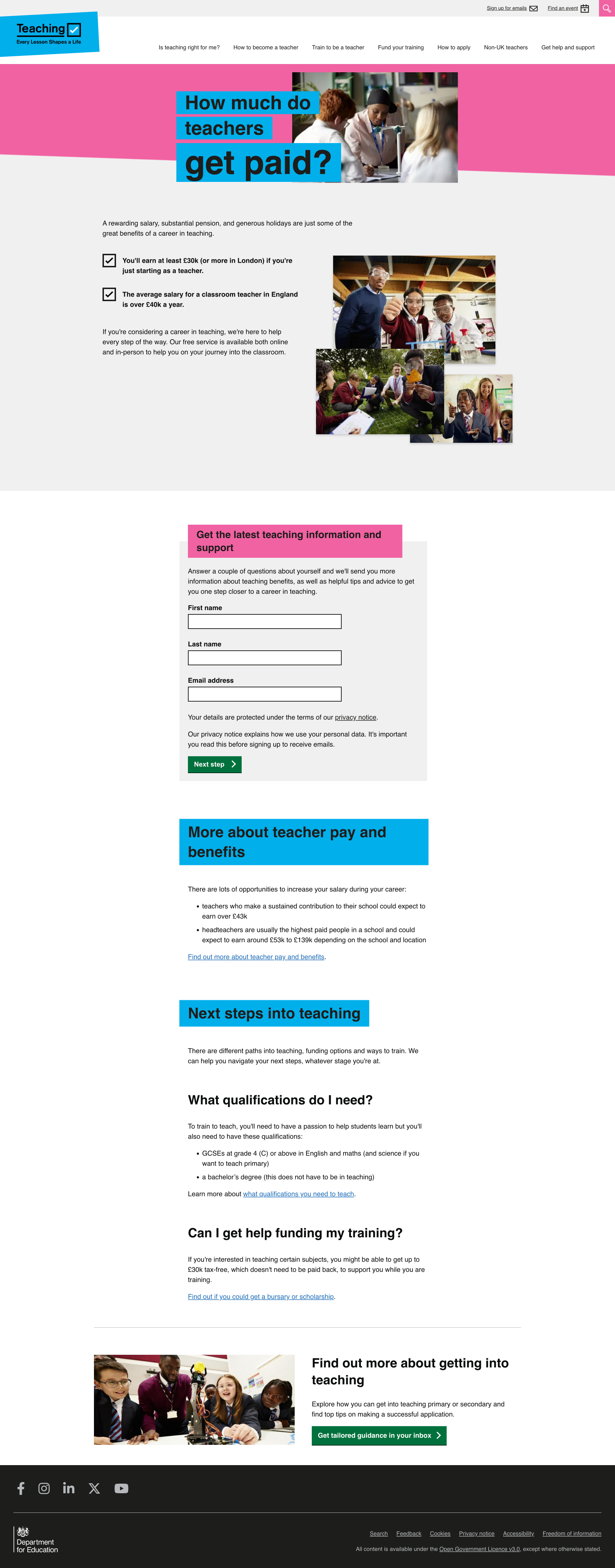
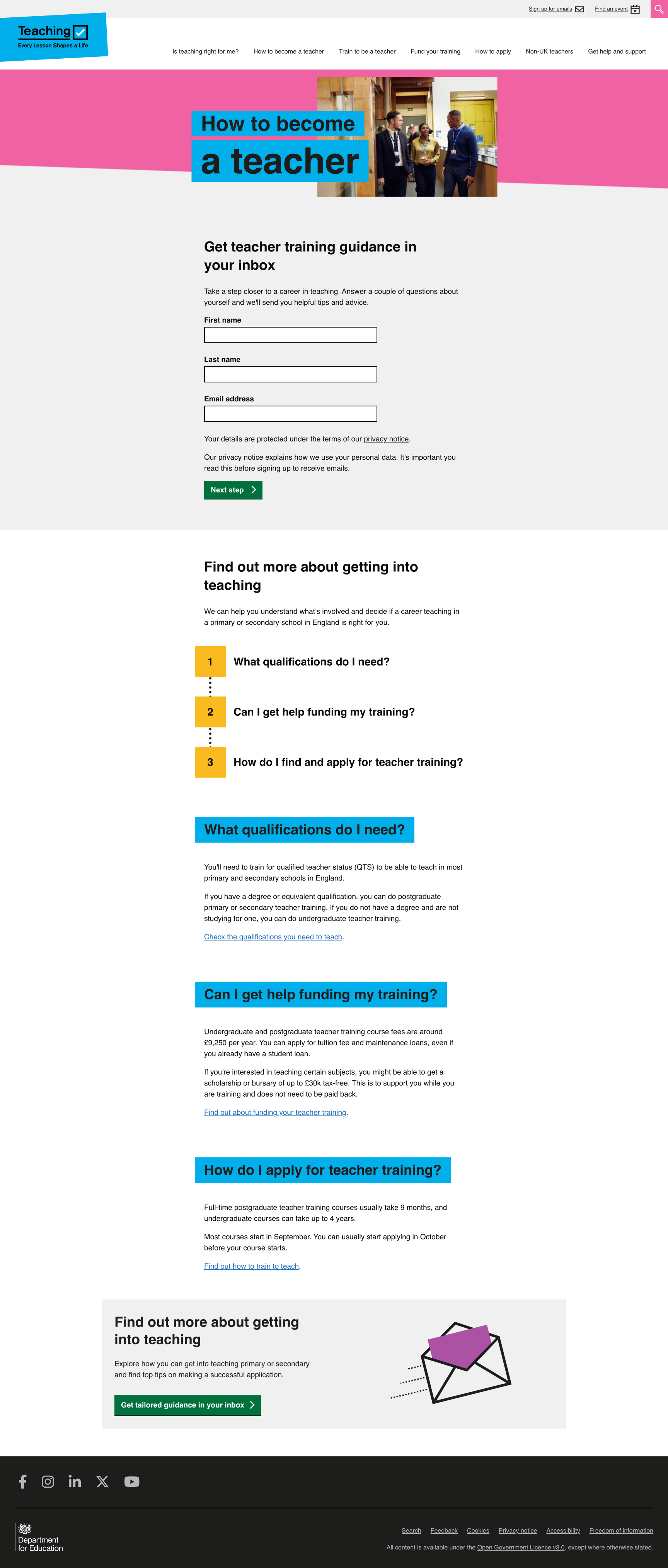
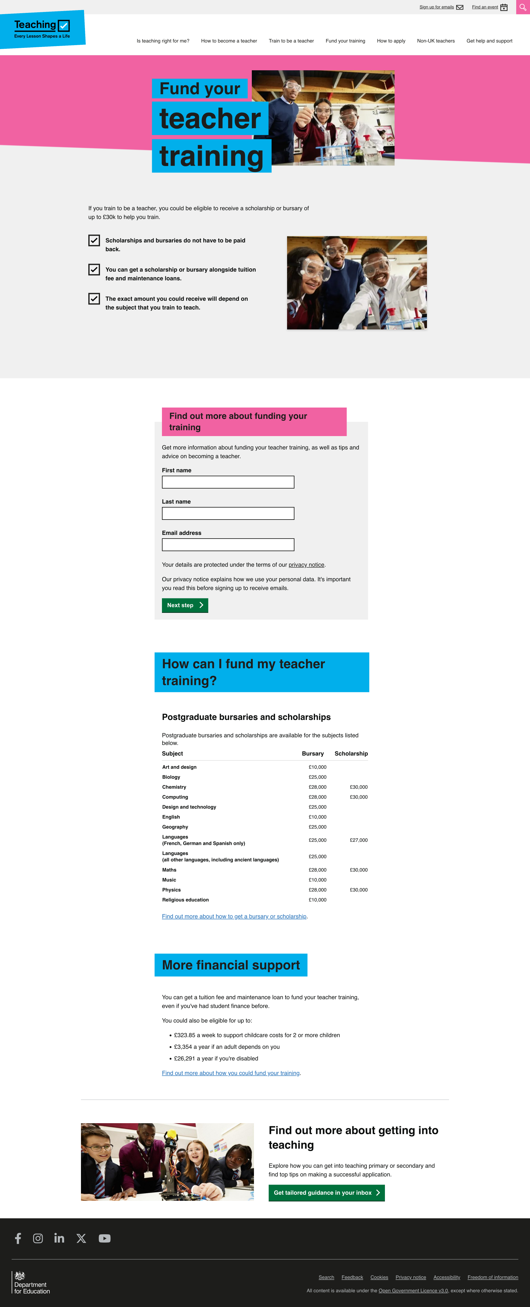
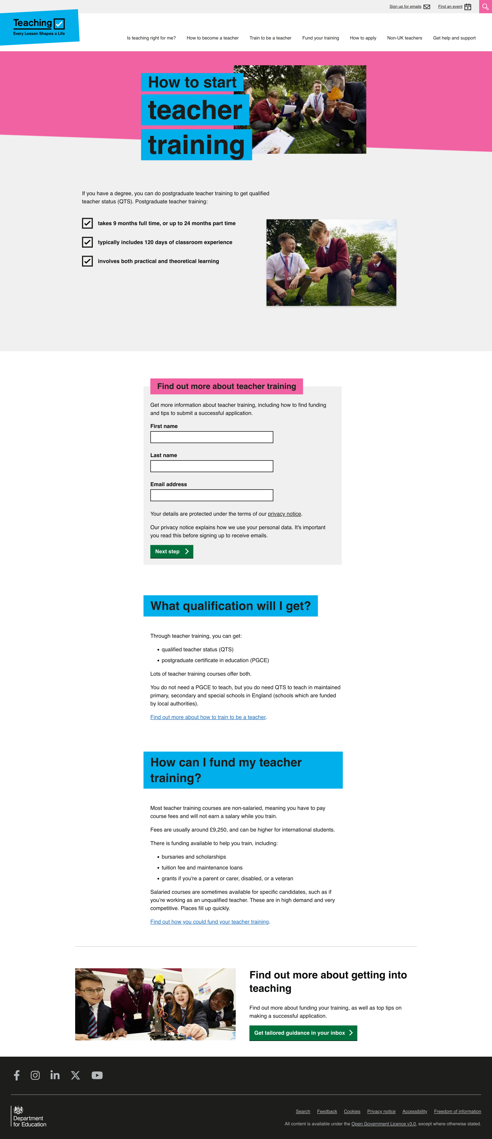
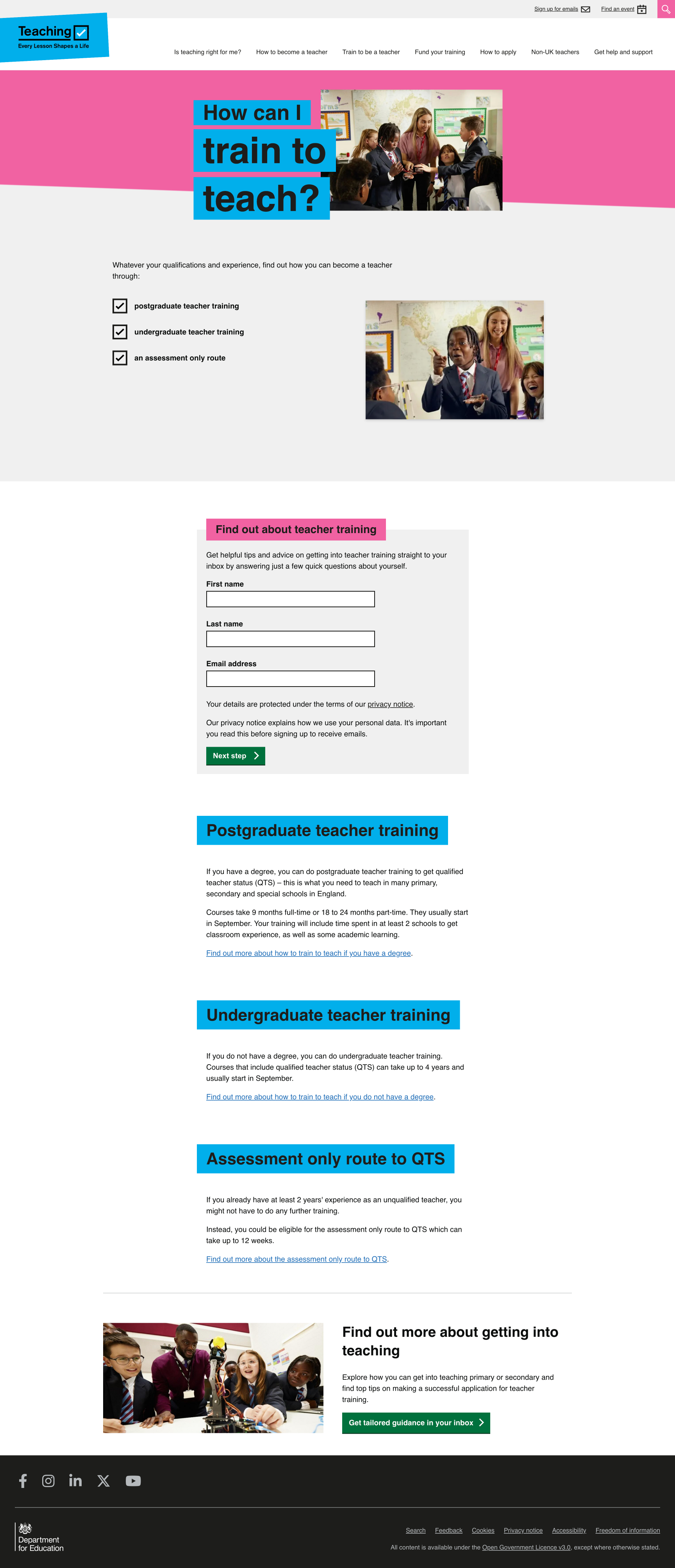
The 2024 campaign provided us with a brand new collection of images, allowing us to refresh various banners across the website. This included the paid search and social media landing pages. Some of these pages featured just on image, whilst others included a collage of photographs. We therefore had to carefully select each image to match the content of the page and create the and appropriate look and feel.
Furthermore, a result of the brand colours update we recently applied to the website, it was important to bring the landing pages up to scratch. This included:
- changing the colour of the hero banner background from yellow to pink
- changing the colour of the h2 background from purple to blue
- ensuring all other components, such as the green CTAs, matched those across the website
The result of these changes was a far more cohesive landing page collection that would help to link our paid search and social media efforts more effectively to the website.
# Screenshots
